

CSS Grid Layout Module
<!DOCTYPE html>
<html>
<head>
<style>
.item1 { grid-area: header; }
.item2 { grid-area: menu; }
.item3 { grid-area: main; }
.item4 { grid-area: right; }
.item5 { grid-area: footer; }
.grid-container {
display: grid;
grid-template-areas:
'header header header header header header'
'menu main main main right right'
'menu footer footer footer footer footer';
gap: 10px;
background-color: #2196F3;
padding: 10px;
}
.grid-container > div {
background-color: rgba(255, 255, 255, 0.8);
text-align: center;
padding: 20px 0;
font-size: 30px;
}
</style>
</head>
<body>
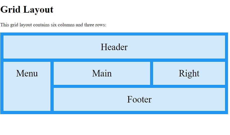
<h1>Grid Layout</h1>
<p>This grid layout contains six columns and three rows:</p>
<div class="grid-container">
<div class="item1">Header</div>
<div class="item2">Menu</div>
<div class="item3">Main</div>
<div class="item4">Right</div>
<div class="item5">Footer</div>
</div>
</body>
</html>
output :-
Grid Layout
The CSS Grid Layout Module offers a grid-based layout system, with rows and columns, making it easier to design web pages without having to use floats and positioning.

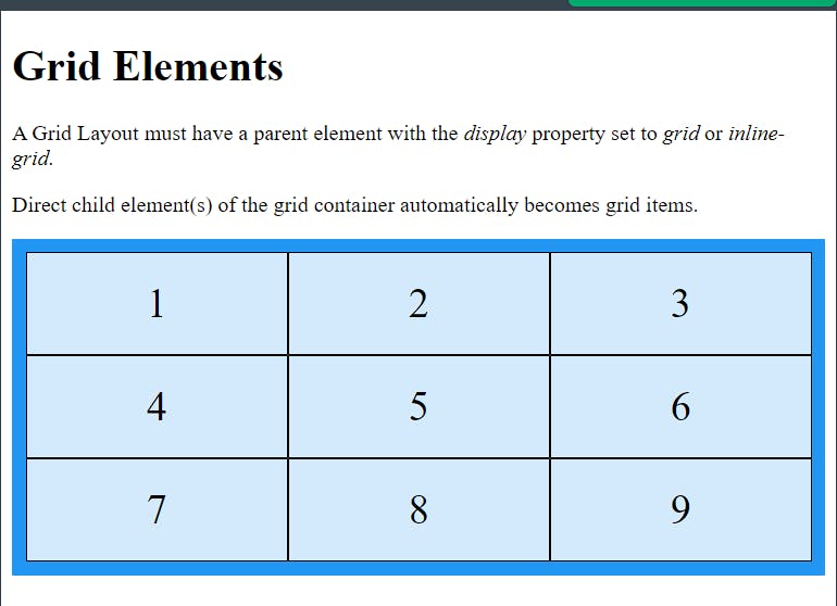
Grid Elements
A grid layout consists of a parent element, with one or more child elements
<!DOCTYPE html>
<html>
<head>
<style>
.grid-container {
  display: grid;
  grid-template-columns: auto auto auto;
  background-color: #2196F3;
  padding: 10px;
}
.grid-item {
  background-color: rgba(255, 255, 255, 0.8);
  border: 1px solid rgba(0, 0, 0, 0.8);
  padding: 20px;
  font-size: 30px;
  text-align: center;
}
</style>
</head>
<body>

<h1>Grid Elements</h1>

<p>A Grid Layout must have a parent element with the <em>display</em> property set to <em>grid</em> or <em>inline-grid</em>.</p>

<p>Direct child element(s) of the grid container automatically becomes grid items.</p>

<div class="grid-container">
  <div class="grid-item">1</div>
  <div class="grid-item">2</div>
  <div class="grid-item">3</div>
  <div class="grid-item">4</div>
  <div class="grid-item">5</div>
  <div class="grid-item">6</div>
  <div class="grid-item">7</div>
  <div class="grid-item">8</div>
  <div class="grid-item">9</div>
</div>

</body>
</html>
output :-

Display Property
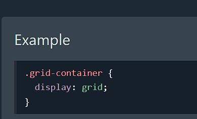
An HTML element becomes a grid container when its display property is set to grid or inline-grid.

All direct children of the grid container automatically become grid items.


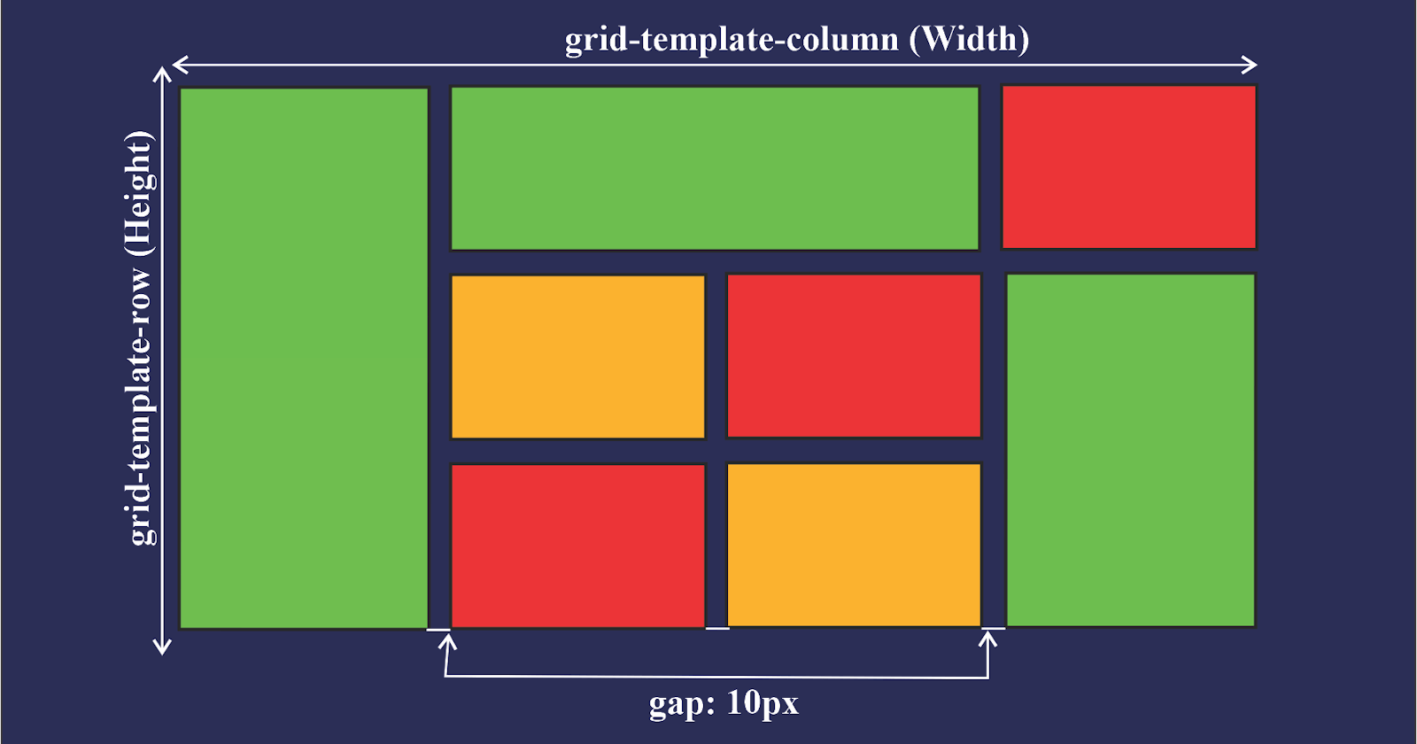
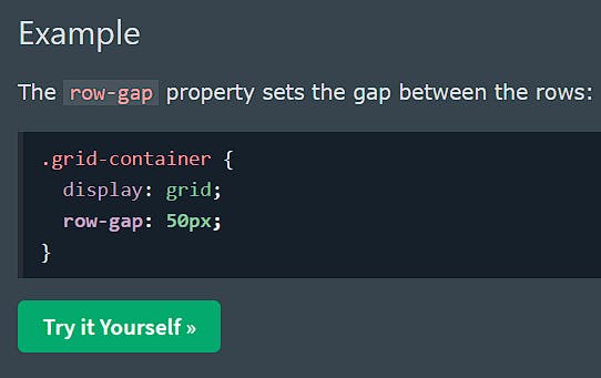
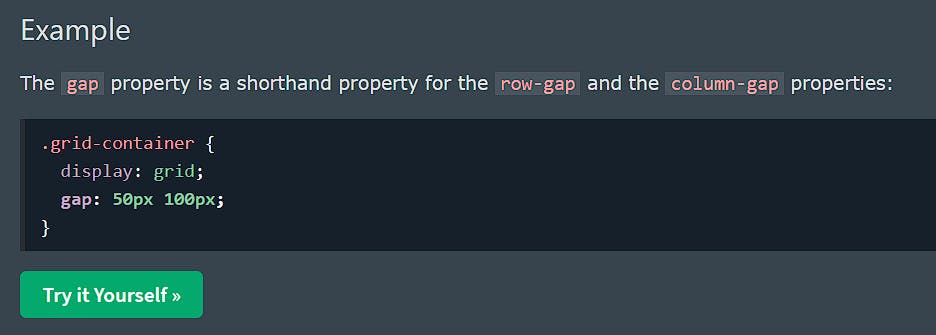
You can adjust the gap size by using one of the following properties:
column-gaprow-gapgap
Example

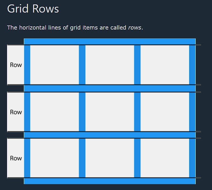
Grid Lines
The lines between columns are called column lines.
The lines between rows are called row lines.

for more stuff please this link :- https://www.w3schools.com/css/css_grid.asp