

CSS Flexbox Layout Module
Before the Flexbox Layout module, there were four layout modes:
Block, for sections in a webpage
Inline, for text
Table, for two-dimensional table data
Positioned, for explicit position of an element
The Flexible Box Layout Module, makes it easier to design flexible responsive layout structure without using float or positioning.
Flexbox Elements
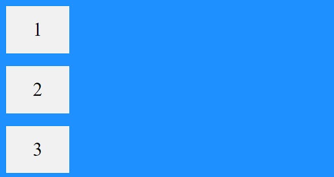
To start using the Flexbox model, you need to first define a flex container.
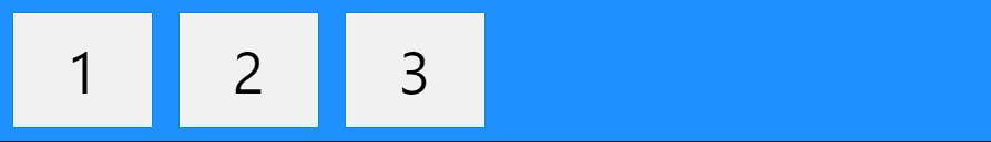
The element above represents a flex container (the blue area) with three flex items.
<div class="flex-container">
  <div>1</div>
  <div>2</div>
  <div>3</div>
</div>
outuput :-
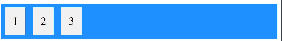
CSS Flex Container
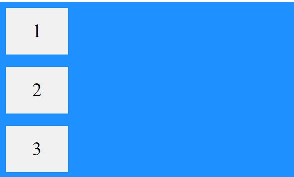
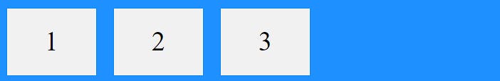
Parent Element (Container)
Like we specified in the previous chapter, this is a flex container (the blue area) with three flex items:
.flex-container {
  display: flex;
}
output :-
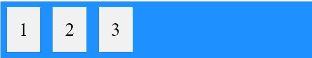
The flex container properties are:
flex-direction
.flex-container {
  display: flex;
  flex-direction: column;
}
.flex-container {
  display: flex;
  flex-direction: column-reverse;
}
.flex-container {
  display: flex;
  flex-direction: row;
}
.flex-container {
  display: flex;
  flex-direction: row-reverse;
}

follow below link to know remaining properties
credits:- https://www.w3schools.com/css/css3_flexbox_container.asp
CSS Flex Items
Child Elements (Items)
The direct child elements of a flex container automatically becomes flexible (flex) items.

The element above represents four blue flex items inside a white flex container.
The flex item properties are:
order :-
<div class="flex-container">
  <div style="order: 3">1</div>
  <div style="order: 2">2</div>
  <div style="order: 4">3</div>
  <div style="order: 1">4</div>
</div>

To know more about flex item properties go through below link
credits :- https://www.w3schools.com/css/css3_flexbox_items.asp