

What is a Media Query?
Media query is a CSS technique introduced in CSS3.
It uses the @media rule to include a block of CSS properties only if a certain condition is true.
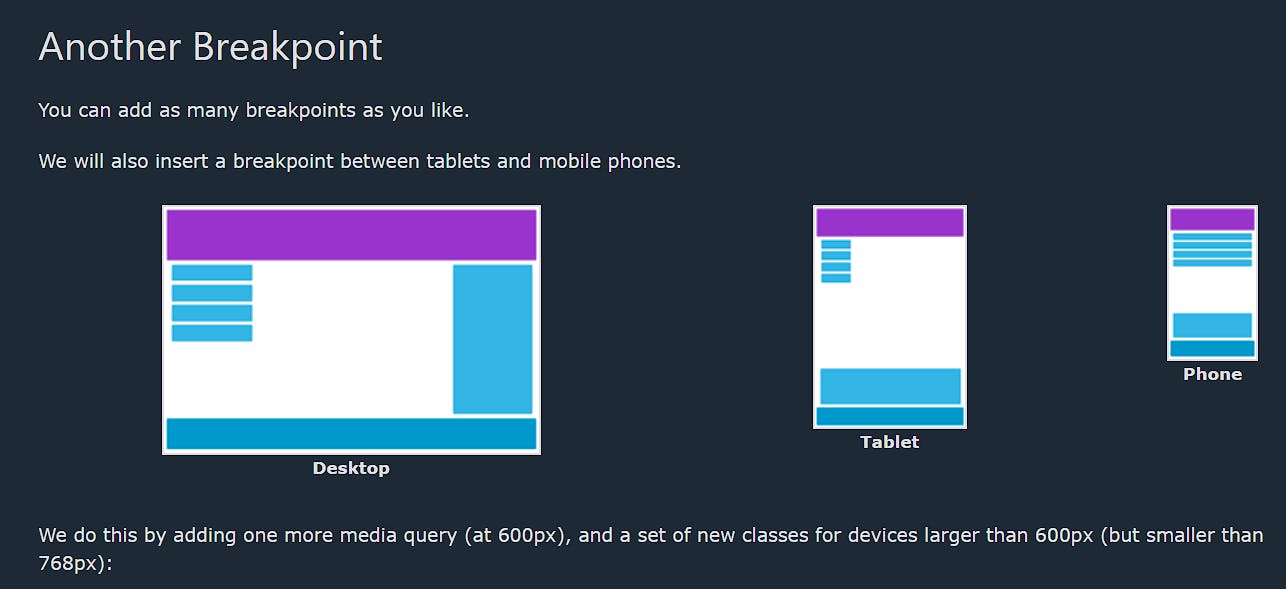
Add a Breakpoint
Earlier in this tutorial we made a web page with rows and columns, and it was responsive, but it did not look good on a small screen.
Media queries can help with that. We can add a breakpoint where certain parts of the design will behave differently on each side of the breakpoint.

<!DOCTYPE html>
<html>
<head>
<meta name="viewport" content="width=device-width, initial-scale=1.0">
<style>
* {
box-sizing: border-box;
}
.row::after {
content: "";
clear: both;
display: block;
}
[class*="col-"] {
float: left;
padding: 15px;
}
html {
font-family: "Lucida Sans", sans-serif;
}
.header {
background-color: #9933cc;
color: #ffffff;
padding: 15px;
}
.menu ul {
list-style-type: none;
margin: 0;
padding: 0;
}
.menu li {
padding: 8px;
margin-bottom: 7px;
background-color: #33b5e5;
color: #ffffff;
box-shadow: 0 1px 3px rgba(0,0,0,0.12), 0 1px 2px rgba(0,0,0,0.24);
}
.menu li:hover {
background-color: #0099cc;
}
.aside {
background-color: #33b5e5;
padding: 15px;
color: #ffffff;
text-align: center;
font-size: 14px;
box-shadow: 0 1px 3px rgba(0,0,0,0.12), 0 1px 2px rgba(0,0,0,0.24);
}
.footer {
background-color: #0099cc;
color: #ffffff;
text-align: center;
font-size: 12px;
padding: 15px;
}
/* For desktop: */
.col-1 {width: 8.33%;}
.col-2 {width: 16.66%;}
.col-3 {width: 25%;}
.col-4 {width: 33.33%;}
.col-5 {width: 41.66%;}
.col-6 {width: 50%;}
.col-7 {width: 58.33%;}
.col-8 {width: 66.66%;}
.col-9 {width: 75%;}
.col-10 {width: 83.33%;}
.col-11 {width: 91.66%;}
.col-12 {width: 100%;}
@media only screen and (max-width: 768px) {
/* For mobile phones: */
[class*="col-"] {
width: 100%;
}
}
</style>
</head>
<body>
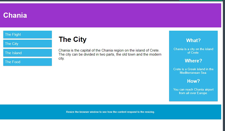
<div class="header">
<h1>Chania</h1>
</div>
<div class="row">
<div class="col-3 menu">
<ul>
<li>The Flight</li>
<li>The City</li>
<li>The Island</li>
<li>The Food</li>
</ul>
</div>
<div class="col-6">
<h1>The City</h1>
<p>Chania is the capital of the Chania region on the island of Crete. The city can be divided in two parts, the old town and the modern city.</p>
</div>
<div class="col-3 right">
<div class="aside">
<h2>What?</h2>
<p>Chania is a city on the island of Crete.</p>
<h2>Where?</h2>
<p>Crete is a Greek island in the Mediterranean Sea.</p>
<h2>How?</h2>
<p>You can reach Chania airport from all over Europe.</p>
</div>
</div>
</div>
<div class="footer">
<p>Resize the browser window to see how the content respond to the resizing.</p>
</div>
</body>
</html>
output :-
for desktop
for mobile

Always Design for Mobile First
Mobile First means designing for mobile before designing for desktop or any other device (This will make the page display faster on smaller devices).
This means that we must make some changes in our CSS.
Instead of changing styles when the width gets smaller than 768px, we should change the design when the width gets larger than 768px. This will make our design Mobile First:

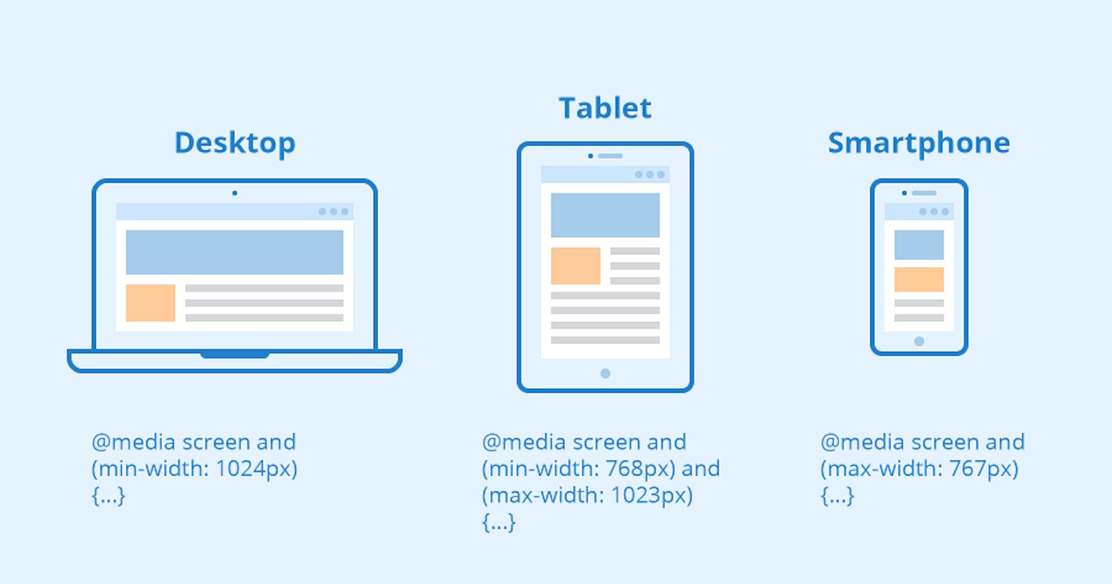
Typical Device Breakpoints
There are tons of screens and devices with different heights and widths, so it is hard to create an exact breakpoint for each device. To keep things simple you could target five groups:
Example
/* Extra small devices (phones, 600px and down) */
@media only screen and (max-width: 600px) {...}
/ Small devices (portrait tablets and large phones, 600px and up) /
@media only screen and (min-width: 600px) {...}
/ Medium devices (landscape tablets, 768px and up) /
@media only screen and (min-width: 768px) {...}
/ Large devices (laptops/desktops, 992px and up) /
@media only screen and (min-width: 992px) {...}
/ Extra large devices (large laptops and desktops, 1200px and up) \/
@media only screen and (min-width: 1200px) {...}
for more info please follow this link:- https://www.w3schools.com/css/css_rwd_mediaqueries.asp